Our Movie's Title Design
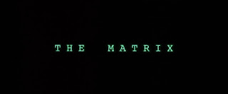
My group has decided to avoid using any more than two or three fonts. The use of various fonts such as this would become a problem. The relative simplicity of only a few fonts is designed to avoid overloading the viewer’s eyes and the title growing too crowded and active. We also have to be mindful of color contrast, avoiding the titles blending in with the background at the moments they are shown. A bad contrast would look like this, seeing as a viewer can barely see the text against the white background. We must also be mindful of our font color depending on the background at the exact moment- a black color would work well on a white background, but not as well on a darker one. As a working idea, the main font will be reminiscent of a computer’s code text (in a technological sense) and the majority of titles will come off of a computer screen whenever the screen is shown. The main title will be in a markedly larger font than the rest of the titles and will be located at the bottom of the screen while the rest will be smaller and in various positions around the screen, but not in positions to obscure the focus of the scene. The plan is for the titles to be on screen for around 10-15 seconds to give viewers enough time to read each one and give us the time to fit all titles into the opening sequence. Only the main title will have the previously mentioned computer text. The rest will fade in and out.
Here's an example of the computer text proposed, The Matrix (1999)'s title screen.

Comments
Post a Comment